
Understanding where fire moves, where it accelerates, and why yesterday’s “safe” area may not be safe tomorrow
Wildfire is no longer a rare, regional concern. It has become a recurring, landscape-shaping force across large parts of North America. For preppers and homesteaders, wildfire risk maps are not about fear — they are about pattern recognition.
Fire does not move randomly. It follows fuel, wind, slope, and access. Wildfire risk maps exist to make those patterns visible before smoke is in the air and evacuation orders are issued.
For preparedness, these maps help you avoid building plans, routes, and fallback locations that quietly fail under fire conditions. For homesteaders, they help you design land use, defensible space, and access in ways that reduce long-term risk rather than amplify it.
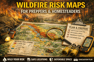
What wildfire risk maps actually show
Wildfire risk maps typically display some combination of:
- historical burn areas
- vegetation and fuel loads
- wildfire hazard potential
- slope and terrain influence
- prevailing wind corridors
- wildland–urban interface (WUI) zones
Some maps focus on probability (likelihood of fire), others on severity (how intense fire is likely to be), and the best ones combine both.
In practical terms, wildfire maps answer questions like:
- Where does fire tend to start?
- Where does it spread fastest?
- Which routes become dangerous early?
- Which areas are repeatedly affected?
- Where does smoke linger?
These answers matter long before flames appear.
Why wildfire risk maps matter for preparedness
1) Fire moves faster uphill — and maps show why
One of the most misunderstood wildfire realities is how strongly slope affects fire behavior. Fire preheats fuel uphill, causing it to spread dramatically faster on inclines.
Wildfire risk maps that incorporate terrain help you identify:
- slopes that act like accelerators
- ridgelines where fire behavior changes
- valleys that trap heat and smoke
A route that looks “out of the way” on a road map may be one of the most dangerous places to be during a fast-moving fire.
2) Wind corridors matter more than distance
People often assume distance from a fire equals safety. In reality, wind direction and terrain alignment matter far more.
Wildfire maps help reveal:
- dominant wind patterns
- funneling effects in canyons
- areas where embers travel miles ahead of the fire
Preparedness planning without wind awareness leads to bad timing decisions and false confidence.
3) Smoke is often the first threat
Wildfire doesn’t just destroy structures — it disrupts life at scale:
- air quality becomes hazardous
- visibility drops
- roads close
- evacuation routes become unsafe
Wildfire risk maps paired with topography help predict where smoke will:
- pool in valleys
- linger for days or weeks
- affect downwind communities
Smoke exposure is a serious health risk, especially for children, the elderly, and anyone with respiratory conditions.
Why wildfire maps are critical for homesteaders
Homesteaders face unique wildfire challenges because they often live:
- near unmanaged vegetation
- on the edge of forest or grassland
- far from immediate emergency response
Wildfire risk maps support:
- defensible space planning
- placement of buildings and outbuildings
- access road design
- water storage and access
- vegetation management decisions
Many homestead losses occur not because of negligence, but because fire behavior was misunderstood.
Maps reduce that misunderstanding.
The wildland–urban interface (WUI): where risk concentrates
The WUI is the zone where human development meets wild vegetation. It is where:
- fire risk is highest
- evacuations are most complex
- suppression resources are stretched
Wildfire maps often highlight WUI zones because:
- ignition sources increase
- evacuation routes are limited
- structure loss risk is high
Preparedness means knowing whether you live in the WUI — and what that implies for response time and options.
Fire history matters more than people think
Areas that have burned before:
- often burn again
- may burn differently depending on regrowth
- can have heavy fuel loads after certain recovery periods
Wildfire history maps help identify:
- recurring fire corridors
- post-burn regrowth risk
- areas that appear “green” but are highly flammable
A landscape’s past is one of the best predictors of its future.
Real-world prepper use cases for wildfire risk maps
Planning evacuation routes that stay viable longer
Wildfire maps help identify:
- routes likely to be cut off early
- roads exposed to ember storms
- canyon roads that trap heat and smoke
- higher-ground routes with better visibility
Knowing which routes fail first lets you time movement intelligently.
Evaluating bug-out and fallback locations
A location that looks remote and quiet may sit directly in a wildfire corridor. Your bug-out and “best places to live” maps become far stronger when wildfire risk is layered in.
Preparedness is not just distance from cities — it’s distance from predictable fire behavior.
Deciding when not to bug out
Sometimes sheltering in place — with preparation — is safer than moving into smoke and traffic.
Wildfire maps help assess:
- whether fire is likely to reach your area
- how wind shifts may change risk
- how long smoke impacts may last
Good decisions depend on understanding patterns, not reacting to headlines.
Where to find wildfire risk maps (real sources)
United States
- U.S. Forest Service – Wildfire Hazard Potential (WHP)
National-scale maps showing where wildfires are most likely to occur and be difficult to control.
https://research.fs.usda.gov/firelab/products/dataandtools/wildfire-hazard-potential - U.S. Forest Service & interagency fire resources (often linked through state forestry agencies for local detail).
Canada
- Canadian Wildland Fire Information System (CWFIS)
Interactive maps showing fire danger, active fires, weather, and fire behavior indicators.
https://cwfis.cfs.nrcan.gc.ca/home
(Tip: regional and provincial fire agencies often provide the most actionable local maps.)
Offline strategy for wildfire awareness
What to keep offline
- wildfire hazard map for your region
- historical burn area map
- evacuation route overlays
- notes on prevailing wind directions
What to annotate
- routes that climb steeply
- narrow canyon roads
- areas with heavy fuel loads
- safe zones with defensible space
Wildfire risk is dynamic — update notes seasonally.
Practice drills that build wildfire literacy
Drill A: “Wind day awareness”
On a windy day, note wind direction and imagine how fire would move across the terrain shown on your maps.
Drill B: “Evacuation timing test”
Ask:
- If a fire started 10 miles away in this direction, how much time would I realistically have?
Drill C: “Smoke logic”
Identify where smoke would pool based on valleys and basins in your area.
Common mistakes with wildfire maps
- Mistake: assuming green means safe
Fix: vegetation type and dryness matter more than color. - Mistake: focusing only on ignition points
Fix: spread behavior matters more. - Mistake: underestimating smoke
Fix: smoke often disrupts life before flames arrive. - Mistake: ignoring wind and slope
Fix: fire follows physics, not expectations.
How wildfire maps connect to your Prepper Map Packs
Your curated maps for:
- best places to live
- bug-out locations
- survive-off-the-land regions
…are incomplete without wildfire context.
Wildfire maps act as a risk filter, helping users understand which otherwise attractive locations may fail catastrophically under fire conditions.
This fits cleanly into the series theme:
“Preparedness isn’t about avoiding every risk — it’s about knowing which risks you’re choosing.”